Case study
The Accelerator: checkout journey
Redesigning the checkout step of a freelancer program, on desktop and mobile
Executive summary
People who already had a Mercado Pago account under one email couldn't pay for The Accelerator with a different email, and the purchase got stuck. I redesigned the checkout step with a "Choose how to pay" block that makes clear where each button leads, created return screens for confirmed, pending and failed payments, and tested with users. The first test showed that no one read the email warning (0 of 3); I replaced the warning with a Yes or No question and, in the second test, 5 of 5 people understood the rule. Overall, 8 of 8 people completed the purchase without help.
Context & problem
The Accelerator is a training program for freelancers promoted by Workana. People reach the sales page after a webinar, with a time-limited discount, and can pay in two ways: Mercado Pago (Pix and bank slip) and Hotmart (card installments).
Where the purchase got stuck
Email conflict at Mercado Pago
People with a Mercado Pago account under one email couldn't pay with another, and the purchase stalled without a clear explanation. This was the client's main concern.
Two payment sites
People had to choose between Mercado Pago and Hotmart without knowing what changed between them, or that they would leave Workana's page to pay.
No guidance after paying
There were no screens explaining what to do when a payment was pending or failed.
Assessment
I reviewed the sales page and both checkouts, from the webinar email to the purchase confirmation, to find where people could get lost.
What the assessment showed
The payment decision happens on Workana's page
The right moment to prevent the email error is before people leave for Mercado Pago, not after.
The platforms showed different information
The program's name, description and price didn't match across the two checkouts, which undermines trust at the moment of paying.
The flow had to work on mobile
People coming from the webinar email often open the link on their phones.
Design decisions & trade-offs
The decisions focused on preventing the error before it happened, rather than only explaining it afterwards.
A "Choose how to pay" block
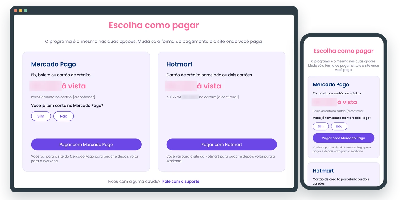
Both options sit side by side, with what changes in each and a note that people will go to another site and then come back to Workana.
From warning to question
In the first test, no one read the warning to use the same email as their Mercado Pago account. I replaced it with the question "Do you already have a Mercado Pago account?": a warning can be ignored, a question asks for an answer.
Return screens for every outcome
Confirmed, pending and failed payment, always with the next step and a way to reach support. The error screen lists the most likely causes, including the email conflict.
Trade-off: a few extra seconds
The question adds a step to the Mercado Pago path. I accepted that cost because a few seconds prevent a stuck purchase.
The solution
The main change lives on the sales page itself, right after the offer, at the point where people decide to buy.
Full sales page
The whole page on desktop, read from left to right. The payment block comes after the offer, at the point where people have already decided to buy.
Choose how to pay · desktop
Mercado Pago and Hotmart side by side, with what changes in each and where each button leads.
Return screens · mobile
In every outcome, people know what happened and what to do next.
Recommendations for the payment platforms
Beyond the design, I marked on the Mercado Pago and Hotmart checkouts what the client could configure so the name, description and price matched on both paths.
User validation
- people completed the purchase without help across both tests
- 8/8
- understood the email rule with the question (with the warning, 0 of 3)
- 5/5
- gave the top ease rating (7 out of 7)
- 7/8
Test 1 · desktop
3 people completed 5 purchase tasks while thinking aloud. All of them finished on their own and rated ease 7 out of 7, but none of them read the email warning.
Test 2 · mobile
5 new people tested the version with the question. All of them noticed it, understood why it mattered and completed purchases through Mercado Pago and Hotmart without help. Four rated ease 7 and one rated it 6, for having to stop and read.
"We were very pleased with the result of the project. The professionalism, the quality of the deliverables and the constant communication throughout the process made all the difference." The Accelerator, 5.0 review on Workana (translated from Portuguese).
| Indicator | Test 1 · desktop | Test 2 · mobile |
|---|---|---|
| People | 3 | 5 |
| Completed without help | 3 of 3 | 5 of 5 |
| Noticed the email rule | 0 of 3 (warning) | 5 of 5 (question) |
| Ease rating (1 to 7) | 7 for everyone | 7 (4 people) and 6 (1 person) |
| Average time | Not measured | 55 s on Mercado Pago, 30 s on Hotmart |
Learnings & next steps
The tests used a prototype and few people (3 and 5): they show a trend, not a precise measure.
Testing early changed the solution
Without the first test, the warning would have gone live with no one noticing it didn't work.
Still to be tested
The question was tested only on mobile, and the error screen wasn't tested on mobile.
Recommendations to the client
Use the same name, description and price on both payment platforms, and a lighter version of the top photo, which loaded slowly on 3 phones.