Case study
Case Management Dashboard & Dynamic B2B Forms
Architectural standardization of an ecosystem with dozens of complex legal and regulatory flows.
Executive summary
Analysts, technicians and judges were losing time and making mistakes when looking up and registering high-volume legal cases in a system with no standardization. I restructured the ecosystem on two fronts: a management dashboard for fast lookup and a progressive intake form with auto-save, reducing rework between Design and Engineering and the time spent searching for cases. The result: 40% less time filling in forms and 25% fewer errors.
Context & problem
Corporate and administrative systems often suffer from piles of disorganized data, cluttered screens and endless forms with no clear hierarchy. The goal was to turn a complex operation into a productive, intuitive and error-proof workspace.
The two main operational bottlenecks
Navigating high-volume dashboards
It was hard to find critical cases, urgent deadlines and up-to-date statuses due to a lack of advanced filters and poorly structured tables.
Long, rigid forms
Entering legal data (parties, lawyers, deadlines, attachments) was costly, with no way to save drafts and high rates of abandonment or incorrectly completed required fields.
Information architecture & B2B UX challenges
The biggest challenge wasn't just visual polish, but the taxonomy and logical sequencing of information.
Pillars of the new information architecture
Progressive disclosure
Instead of showing dozens of fields at once, the form was split into logical, sequential sections (Case Details → Parties → Documents → Review).
Balanced data density
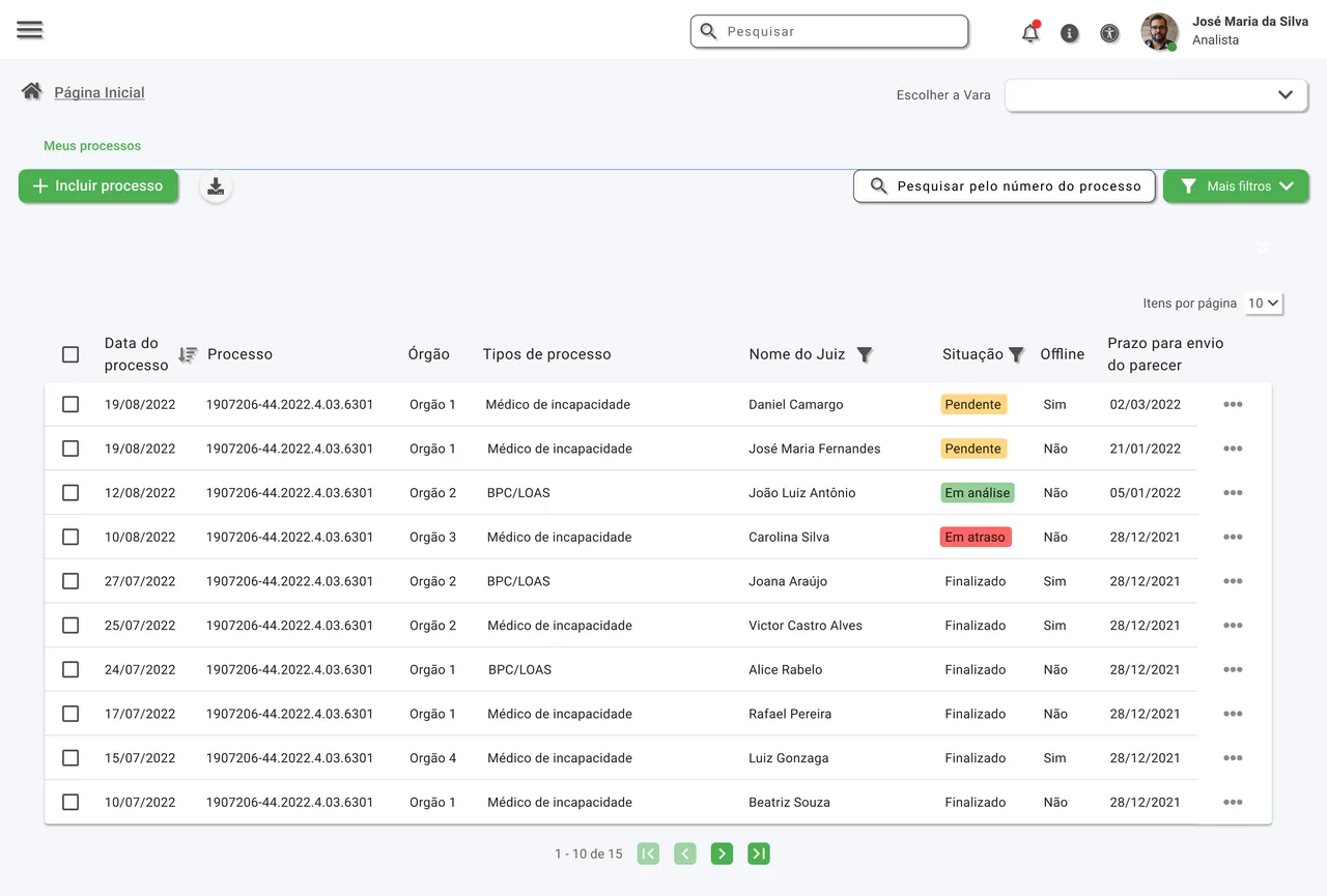
Operational tables able to show multiple attributes (number, type, assigned judge, deadline, status) without visual clutter or excessive scrolling.
Error prevention
“Save draft” and “Preview template” features that let users pause and review before final submission.
Design decisions & trade-offs
Global search vs. combined filters
We chose faceted filters aligned with a quick search bar, so analysts can find a specific case by number, date or status in fewer than 3 clicks.
Step-by-step wizard vs. single page
Progressive steps were chosen to reduce cognitive load, grouping related fields without losing sight of overall progress.
Visual deadline management
Status markers and micro-badges (e.g. “Urgent”, “Under review”, “Done”) with accessible color coding for instant recognition in the case list.
The solution
A. Case Management Dashboard
A table interface optimized for fast lookup, with clean pagination, column sorting by priority/deadline and contextual tab navigation.
B. Case Intake Interface
A data-entry flow structured in collapsible blocks and clear steps, with real-time validation of required fields and draft support.
Case dashboard
Intake form
The steps of the new form
-
Step 1Parties
-
Step 2Lawyers
-
Step 3Subject of the claim
-
Step 4Attach documents
-
Step 5Case details
Documentation & handoff
To make sure the product vision translated faithfully into front-end development, I created a handoff package and design specifications:
Component guide and design system
Functional specs for tables, buttons, modals, inputs, status tags and filters.
Grid and spacing specification
Rigorous definition of margins, paddings and responsive rules for different corporate screen resolutions.
Interaction state mapping
Default, hover, focus, filled, error, loading and success.
Error flows and edge cases
System behavior on connection drops or data inconsistencies.
Results & metrics
- less time spent filling in forms
- 40%
- fewer errors when filling in forms
- 25%
Business impact & learnings
Standardization and scale
The component and form structure became a reusable foundation for other modules of the system.
IT team efficiency
Complete documentation reduced support questions during sprints and eliminated UI refactoring rework.
Productivity gains
End users reported finding pending items faster and feeling more confident when registering new cases.